Styling: Client Onboarding
The Client Onboarding provides various styling options for customizing the sliders used in the client sign-up form. These sliders allow users to select the number of dogs and cleanup frequency. Below are the styling options available to adjust the appearance and behavior of these sliders.
Accessing the Styling Settings
To access the styling settings for the Client Onboarding:
- Log in to your WordPress admin dashboard.
- Navigate to WP Admin → Client Onboarding → Settings.
- Click on Styling Tab
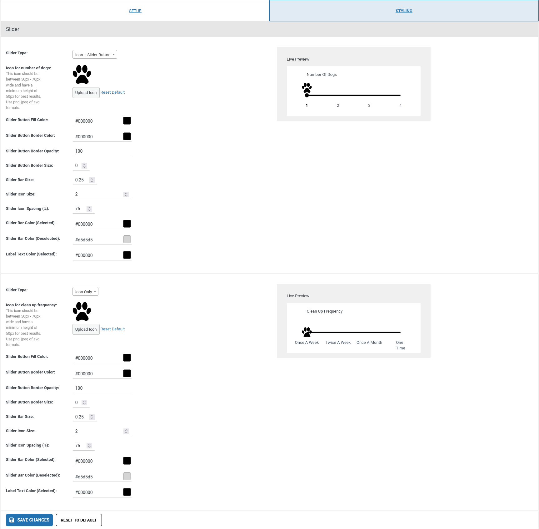
Available Styling Options
1. Slider Type
- Description: Choose the type of slider that best fits your design.
- Icon Only: Displays only the icon for selection.
- Icon with Slider Button: Shows an icon above the slider button (the dot on the slider).
2. Icon
- Description: Upload an icon to represent the number of dogs in the slider.
- Recommended Size: The icon should be between 50px - 70px wide and have a minimum height of 50px for best results.
- Options:
- Upload Icon: Click to upload your custom icon.
- Reset to Default: Click to revert to the default icon.
3. Slider Button Fill Color
- Description: Change the fill color of the slider button (the dot or icon representing the selection).
- Options: Choose any color using hex, RGB, or named color formats.
4. Slider Button Border Color
- Description: Set the color for the border of the slider button.
- Options: Choose any color for the border surrounding the slider button.
5. Slider Button Border Opacity
- Description: Adjust the opacity of the border around the slider button.
- Options: Set the opacity level from 0 (completely transparent) to 1 (fully opaque).
6. Slider Button Border Size
- Description: Control the size (thickness) of the border around the slider button.
- Options: Set the border size in pixels.
7. Slider Bar Size
- Description: Adjust the thickness of the slider bar.
- Options: Set the bar's size in pixels for a thicker or thinner appearance.
8. Slider Icon Size
- Description: Change the size of the icon used in the slider (if the slider type is set to Icon Only or Icon with Slider Button).
- Options: Choose the size in pixels (typically between 50px and 70px wide for the best result).
9. Slider Icon Spacing (%)
- Description: Set the amount of space between the slider icon and the slider button (if the slider type is set to Icon with Slider Button).
- Options: Adjust the percentage to control how far apart the icon and button are.
10. Slider Bar Color (Selected)
- Description: Choose the color for the portion of the slider that represents the selected range.
- Options: Select a color to indicate the selected area on the slider bar.
11. Slider Bar Color (Deselected)
- Description: Choose the color for the portion of the slider that is not selected.
- Options: Select a color for the deselected area on the slider bar.
12. Label Text Color (Selected)
- Description: Change the color of the label text when the slider is selected.
- Options: Select a color for the text that will appear next to the slider, indicating the selected value.
Screenshots