Styling Pricing Plans in the Client Onboarding Form
In this tutorial, you'll learn how to style the pricing plans in the Client Onboarding form based on a custom design provided by our designer. If you're working with a more complex layout, we recommend collaborating with a designer to achieve the best results.
Styling Pricing Plans with Service Plan Styling Options
The Client Onboarding plugin includes basic styling options you can use to customize your onboarding form and pricing plans.
If you’ve already enabled pricing plans in the Employee Portal:
- Settings > Pricing Setup > Service Plans > Enable display of service plans
Go to:
- WordPress Dashboard > Client Onboarding > Settings > Service Plans
Then enable Service plan styling by selecting Enabled.
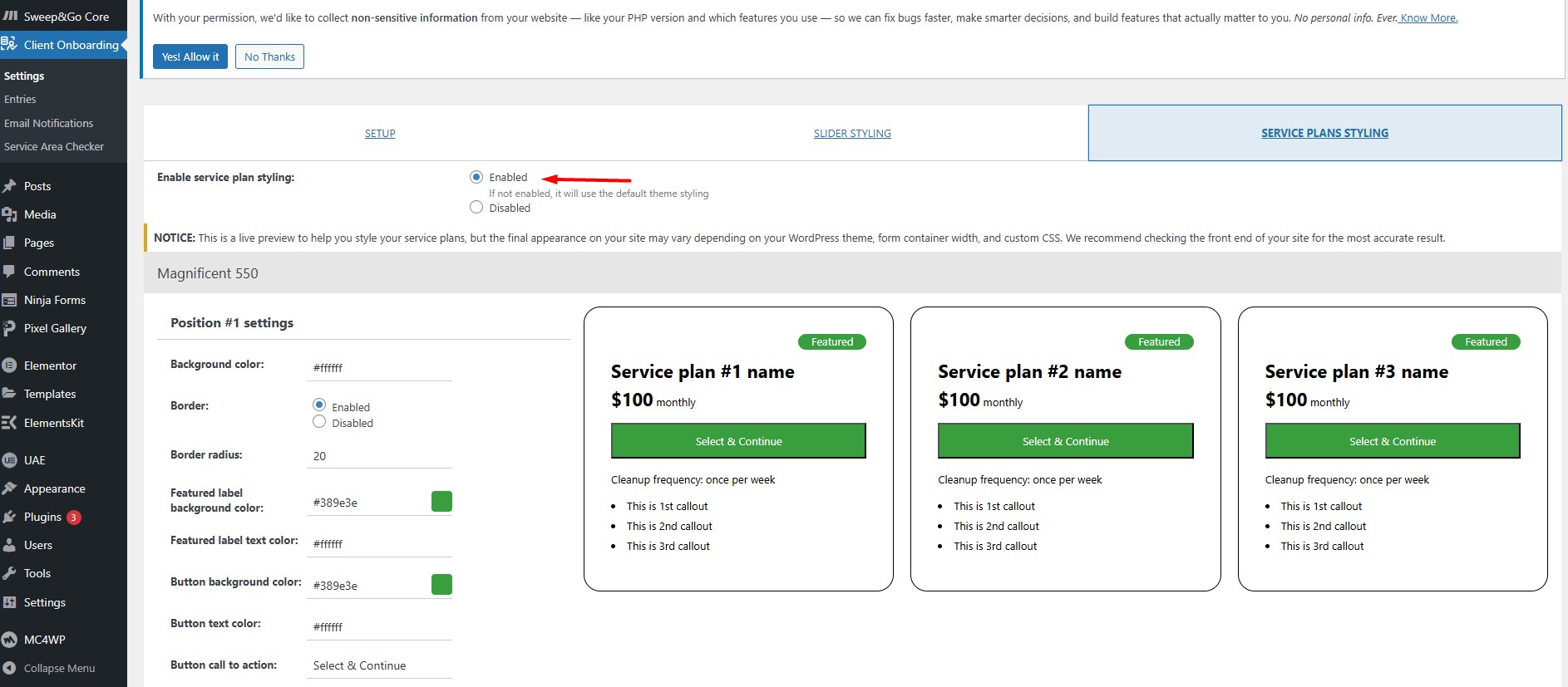
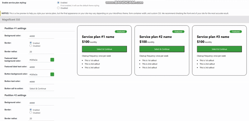
The service plan styling options offer basic settings like:
- Background colors for each plan
- Border radius
- Featured label background color
- Call-to-action button text
Styling Pricing Plans Using CSS
In this example, we’ll demonstrate how to style the service plans using custom CSS.
We’ll add a white background to the wrapper holding the plans, add padding, and round the corners with a border radius. We’ll target the .sng-service-plans-wrap class, and to avoid conflicts with default plugin styles, we’ll include the form ID:
#client_onboarding_form .sng-service-plans-wrap {
  background: #fff;
  border-radius: 64px;
  padding-bottom: 25px;
}
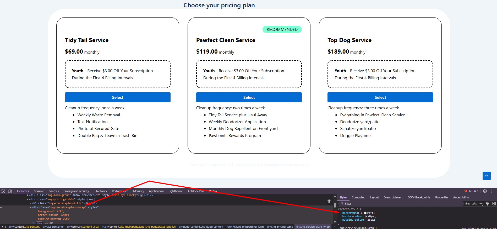
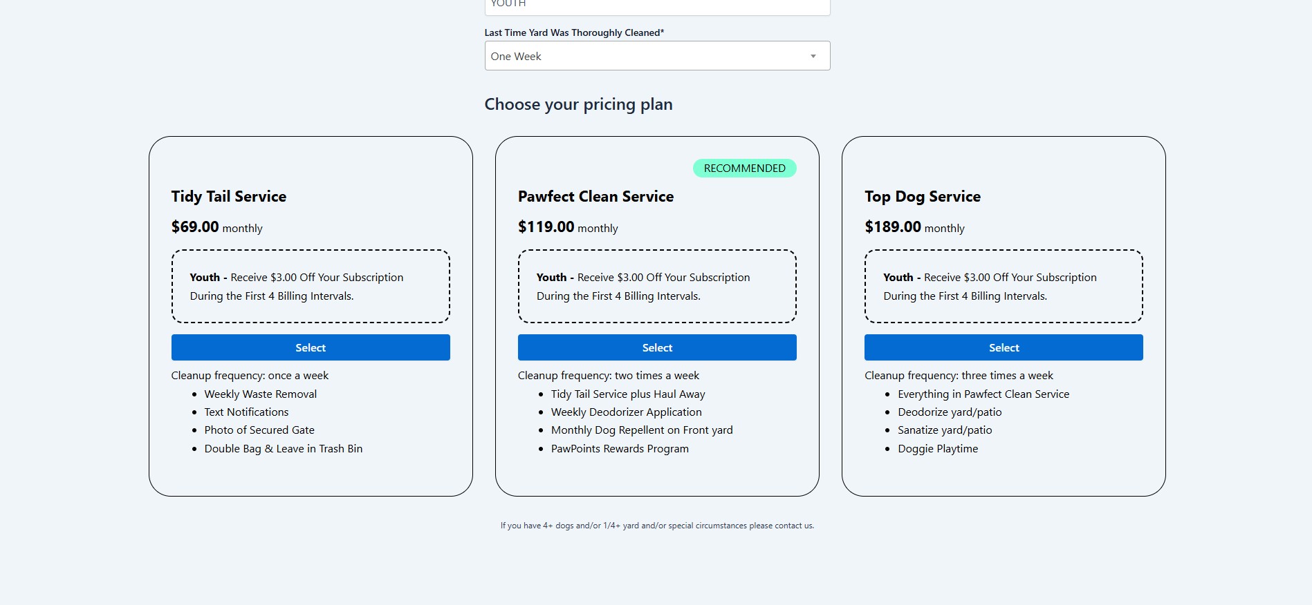
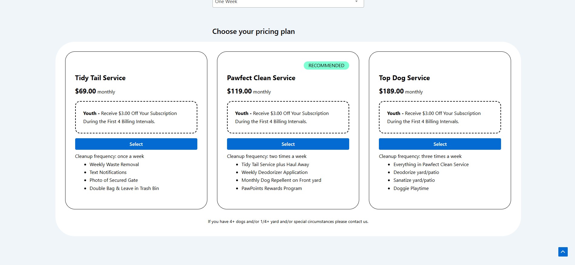
As seen in the image, the title is too close to the wrapper, and the disclaimer text below the plans is not visible. We'll fix this by adding margin-bottom to the pricing plan title and changing the disclaimer text color.
“Choose Your Pricing Plan” – Styling
We’ll use the following selector to style the title:
#client_onboarding_form[data-form="service_plans"] .sng-choose-plan-title {
  font-size: 24px;
  margin-top: 30px;
  font-weight: 500;
  margin-bottom: 20px;
  color: #000000;
}
Note: The [data-form="service_plans"] attribute is used to distinguish between onboarding forms with service plans and those without. This is helpful if you've previously styled the form before service plans were added.
Disclaimer – Styling
To style the disclaimer, use the .sng-service-plans-disclaimer class:
#client_onboarding_form .sng-service-plans-disclaimer {
  color: #000000;
  font-size: 14px !important;
  font-weight: 400;
  text-align: center;
  line-height: 16px;
}
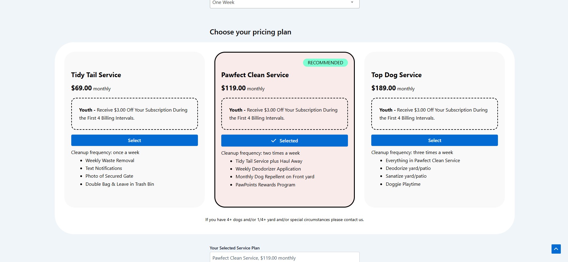
Styling Pricing Plan Boxes
We'll change the background color of all pricing plan boxes. Featured plans will have a different color, and the selected plan will be highlighted with a border.
All plan boxes:
#client_onboarding_form .sng-service-plans-wrap .sng-service-plan {
  background: #f9f9f9;
  border: 3px solid transparent;
  padding: 20px 20px 37px;
  border-radius: 35px;
}
Featured/Recommended box:
#client_onboarding_form
  .sng-service-plans-wrap
  .sng-service-plan[data-featured="1"] {
  background: #faebeb;
}
Selected box:
#client_onboarding_form .sng-service-plans-wrap .sng-service-plan.selected {
  border: 3px solid #000000;
}
Additional Customization
Using this approach, you can customize nearly every part of the form, including:
- Recommended/Featured label
- Pricing plan titles
- Prices and intervals (e.g., monthly)
- Coupon container
- Action buttons
- Feature lists
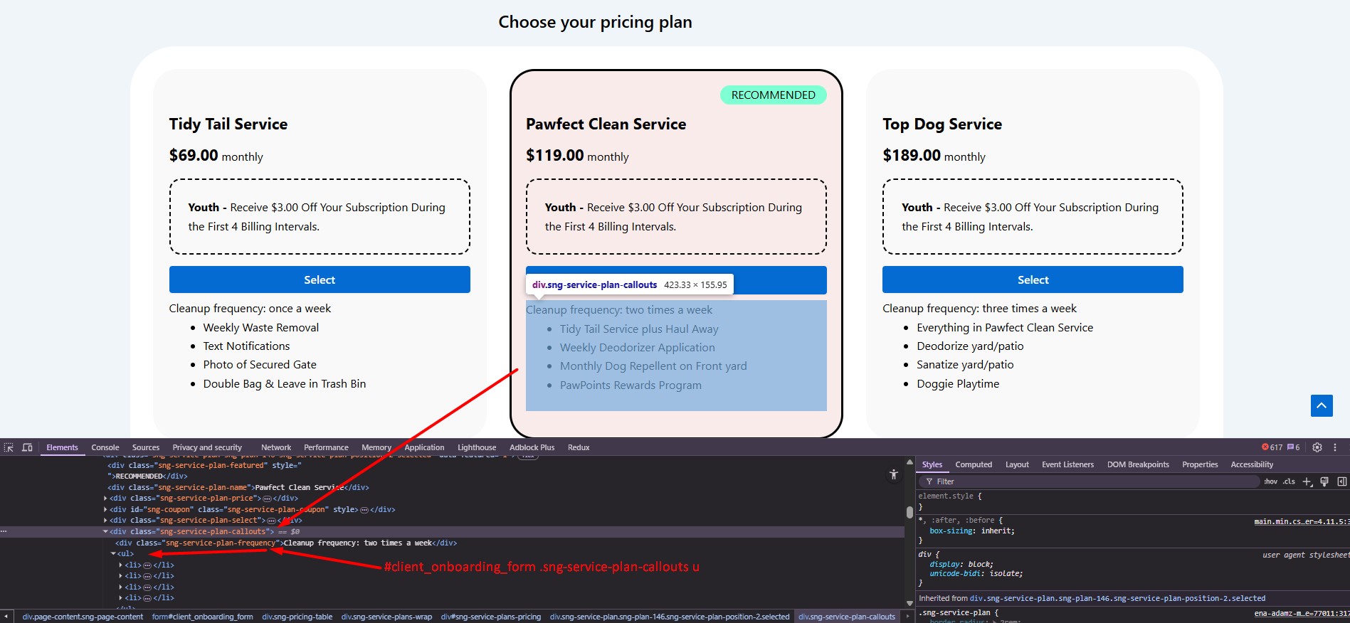
- If you’re unsure how to target a specific element, use the Inspect Element tool in your browser to locate the correct CSS class.
📌 Final Tip
Don’t forget to test your changes on mobile devices as well. It’s important to ensure your design looks great on all screen sizes!